I was hired to create the interior layout for Jen Hatmaker’s book, 7 Days of Christmas. The cover had previously been designed by another designer and approved. My job was to create an interior that looked rich and elegant using only two colors.
Two color layouts present several challenges. For this project, one color needed to be dark enough so that the type is strong and easy to read. The other color needed to contrast the deep one and allow the artwork to look its best. And the colors needed to harmonize with the existing cover. The two colors the client and I decided on were navy and metallic copper. The navy is strong for the type and when screened back has a light blue-gray look to it which gives us the look of a third color. The book also contains solid copper end sheets and shiny copper ribbon.
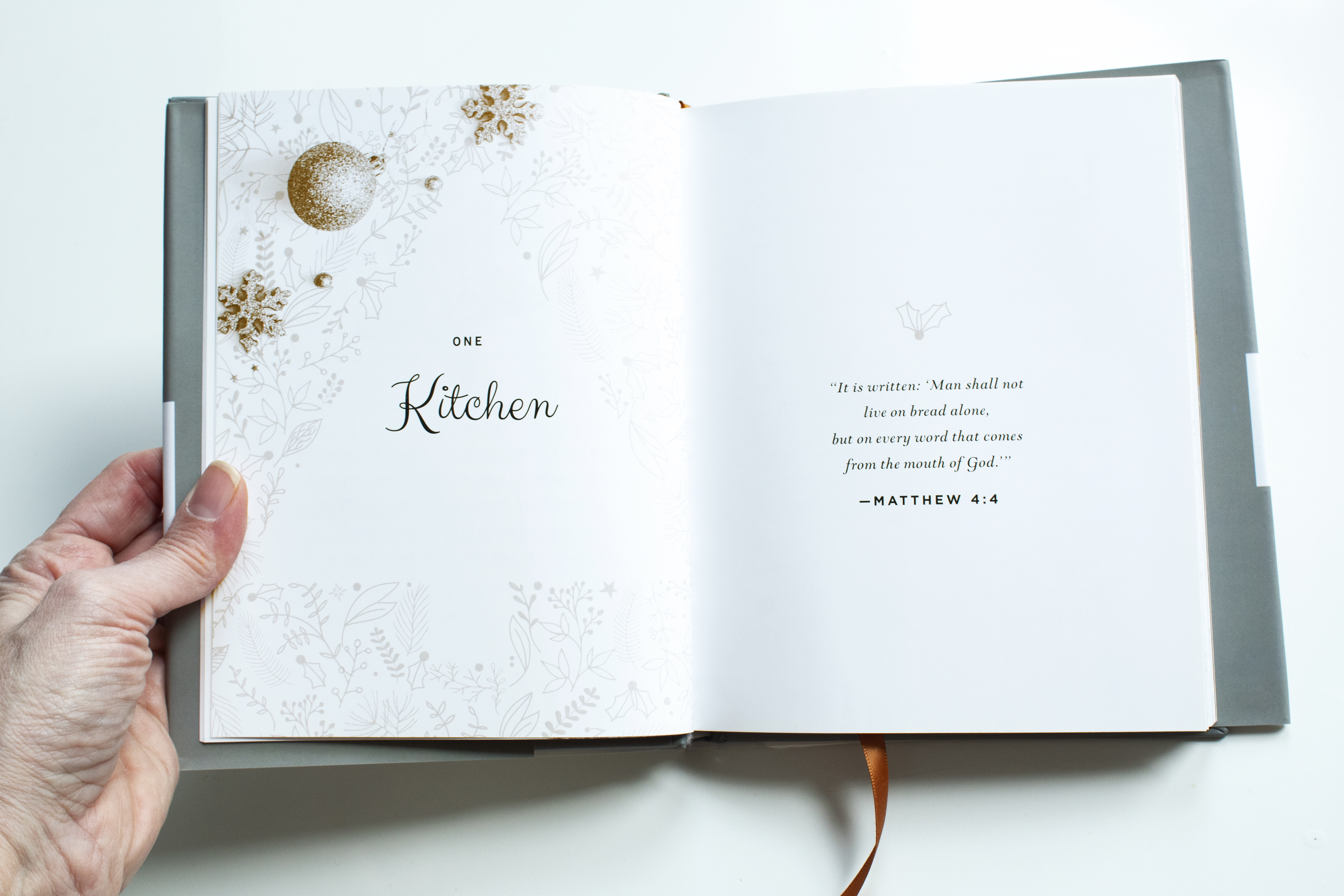
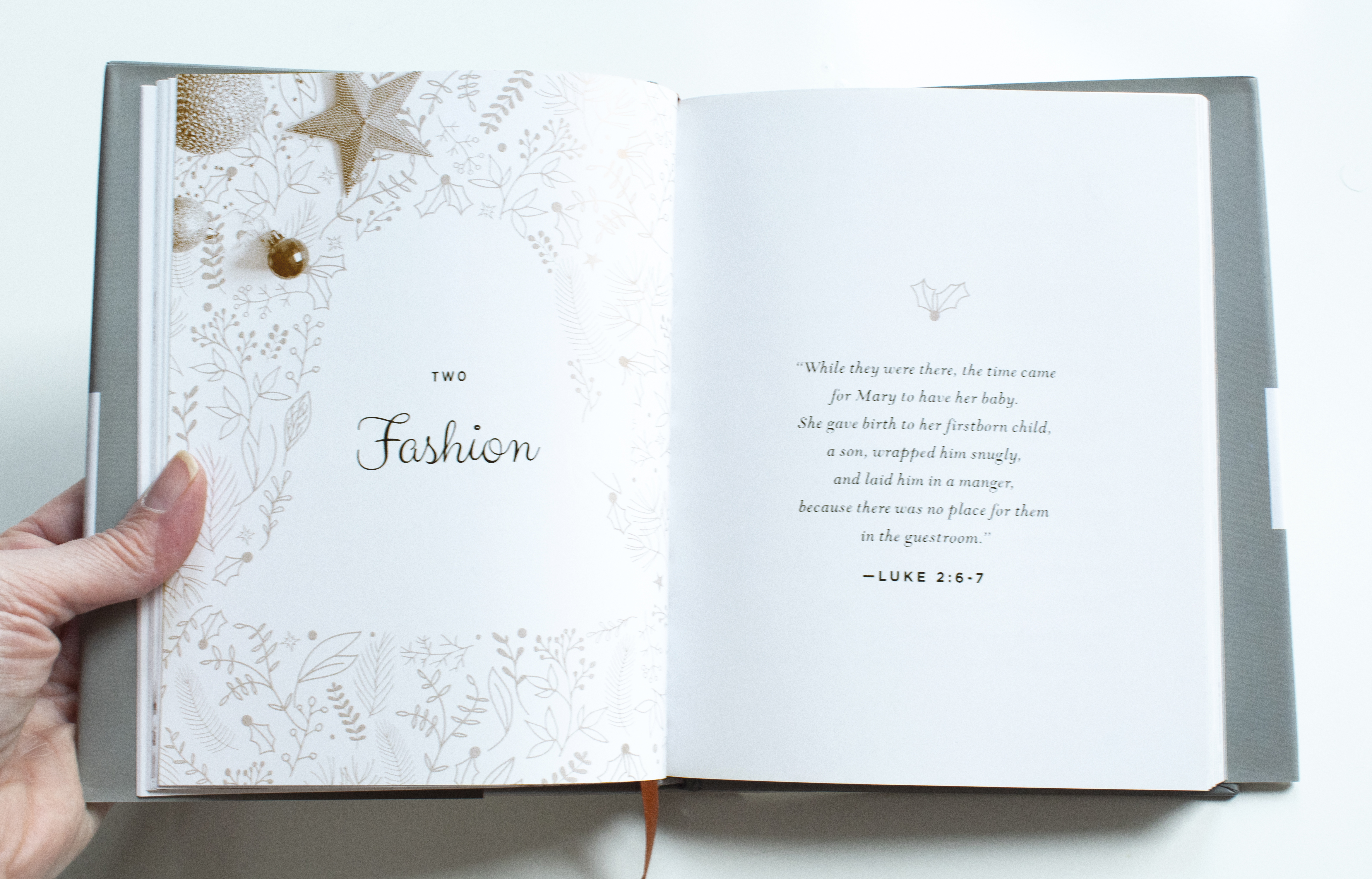
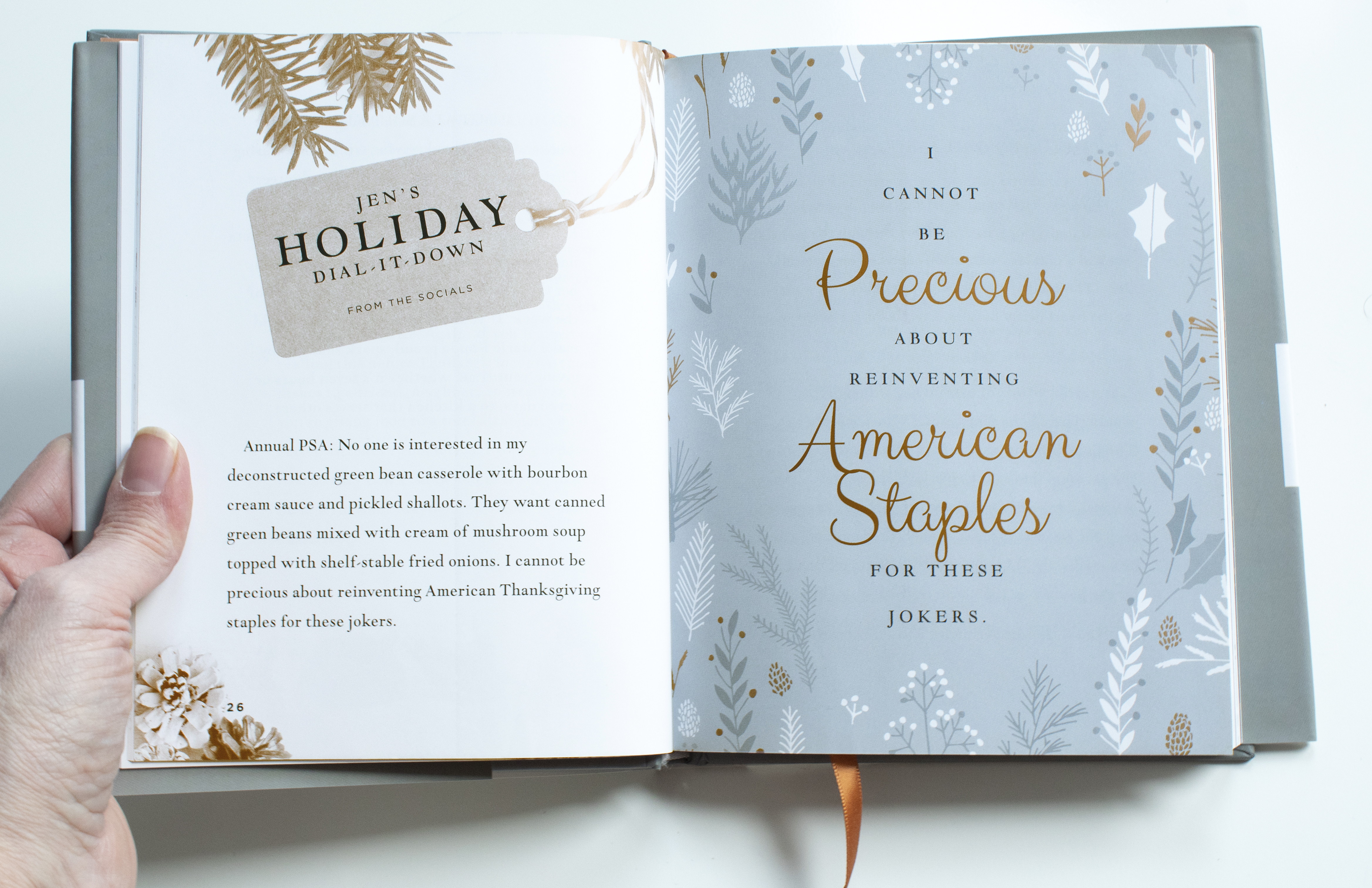
Each chapter header page contains negative space art and a scripture verse. Each chapter has a spread entitled, “Jen’s Holiday Dial it Down”. The last page of each chapter contains a special quote from the author.
Back to Categories >>Next Post Previous Post<<